
Overview
For this project, I selected a public website and analyzed, redesigned, and implemented a responsive version of it. The goal was to address previously identified useability problems and then correct them with a more user-friendly, accessible, and responsive new website.
Project Links
Original Website: OLY Swimming Home
Redesigned Website: Redesigned OLY Website
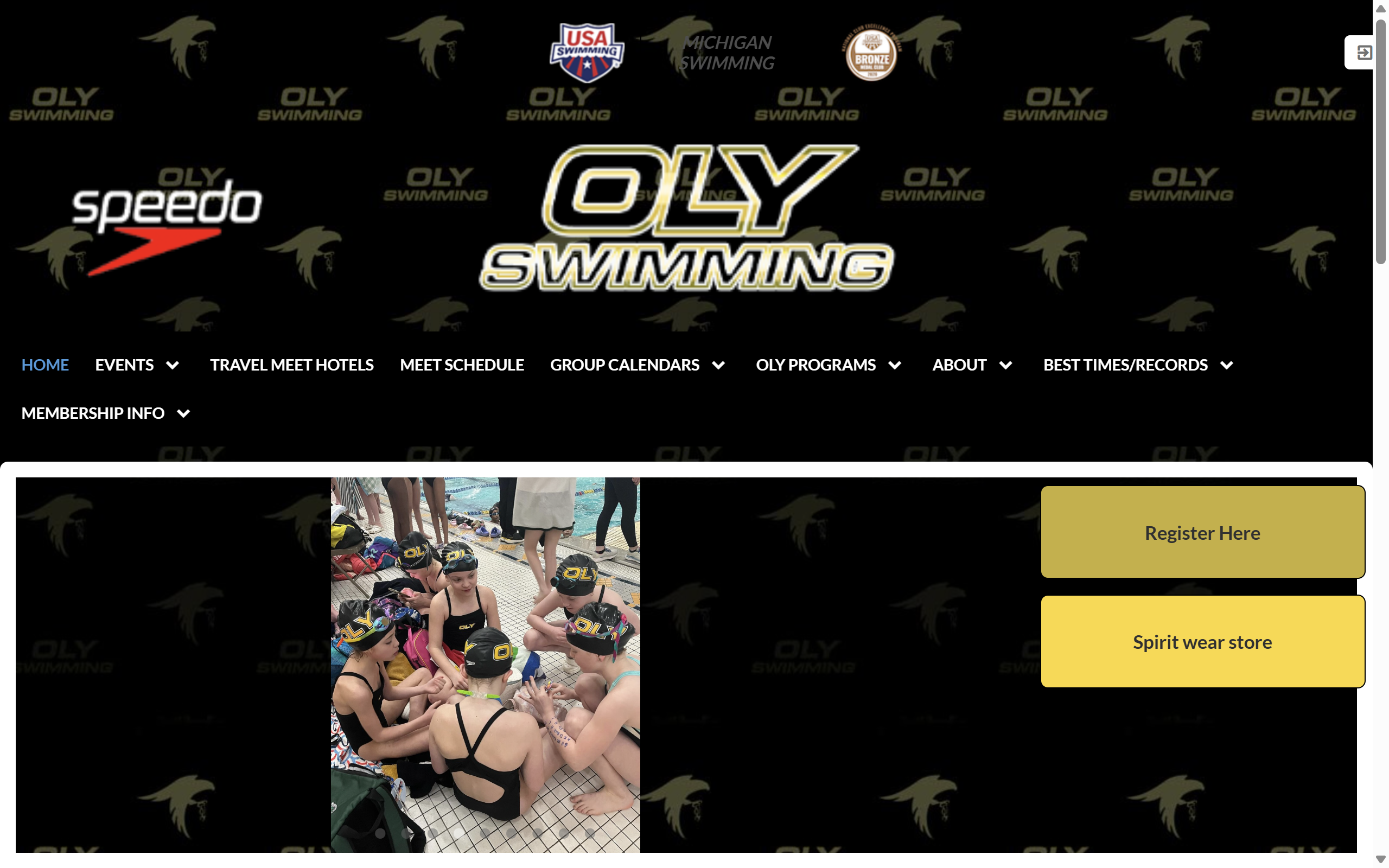
Original Website
I chose to redesign the OLY Swim Team website because it's publicly accessible, not particularly popular, and has a confusing and overwhelming layout.
Identifying Usability Problems
I analyzed the website based on three key usability criteria: efficiency, learnability, and memorability. I also assessed the site's conceptual model and accessibility.
Efficiency Issues
- The arrows to navigate between images only appear on hover and often don't work, requiring multiple clicks
- Dropdown menus in the navigation bar extend below the viewport, requiring users to scroll down
- Photo transitions are unnecessarily slow, even for previously loaded images (try clicking 3+ photos under the facebook post)
- Most sections under "Upcoming Events" don't display anything except for "Team Events", and are redundant or useless
Learnability Issues
- Inconsistency in header logos: all are clickable except the Speedo logo, which causes a misleading conceptual model
- Important buttons like "Register Here" and "Spirit Wear Store" are tucked away
- The login button is hidden at the top of the screen with no descriptive text
- The "Pool" text changes the cursor to indicate it's clickable, but nothing happens when clicked, conflicting with a conceptual model
Memorability Issues
- Visual clutter and oversized header make the site layout difficult to remember
- The "more events" button at the bottom of the events list redirects the user instead of expanding the list, which is a misleading conceptual model. A "see more" type button normally loads more content instead of redirecting.
Accessibility Analysis
There are many accessibility issues caught by WebAIM WAVE as well. There's little contrast between lots of the text on the screen, particularly when buttons are hovered, causing an accessibility issue and strain on the eyes. Also, no photos or links have alt text provided. Furthermore, many items are in black boxes against a black background, making it difficult to see them.
Visual Redesign
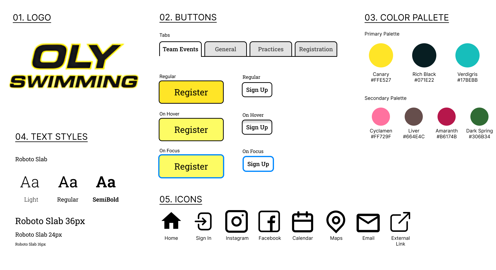
Style Guide
To begin redesigning the webiste, I created a comprehensive style guide to reference:
Mockups
I also developed annotated mockups for desktop, tablet, and mobile views to ensure a responsive design:
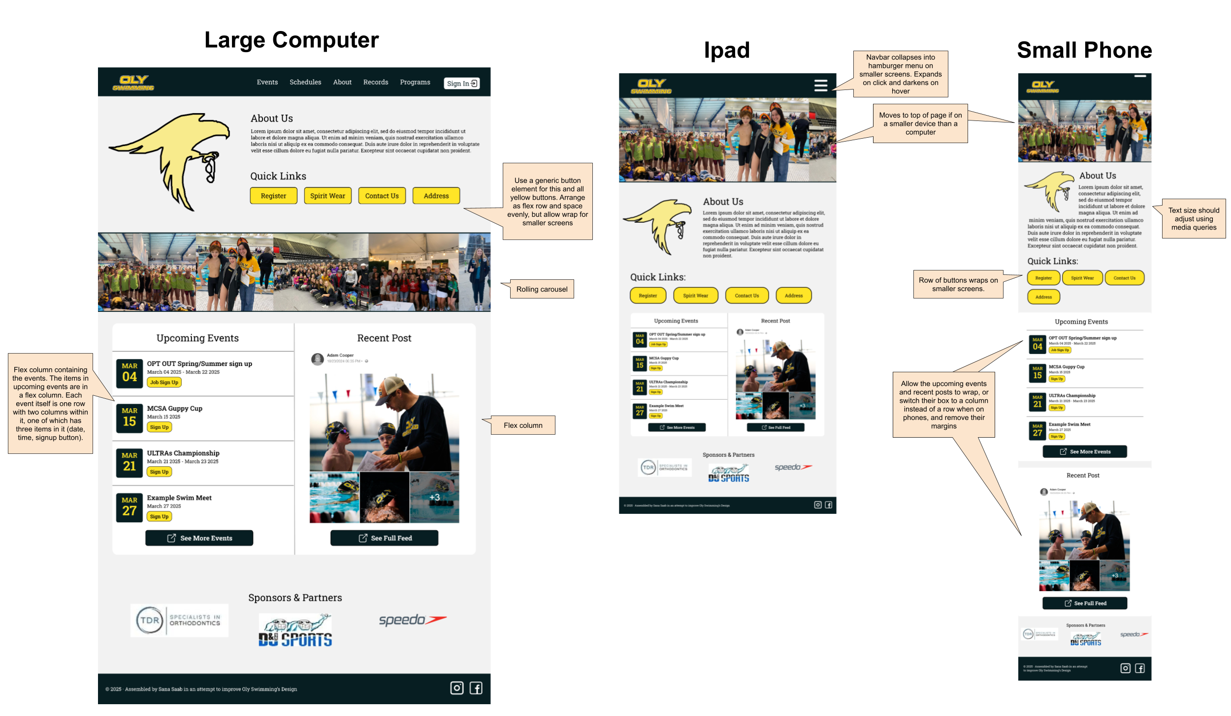
Each mockup is annotated with layout decisions, responsive elements, and interaction states to guide the implementation process. Key responsive design decisions include:
- Collapsing the navigation menu into a hamburger menu on mobile
- Adjusting grid layouts to stack vertically on smaller screens
- Increasing button and touch target sizes on mobile devices
- Using relative font sizes to ensure readability across devices
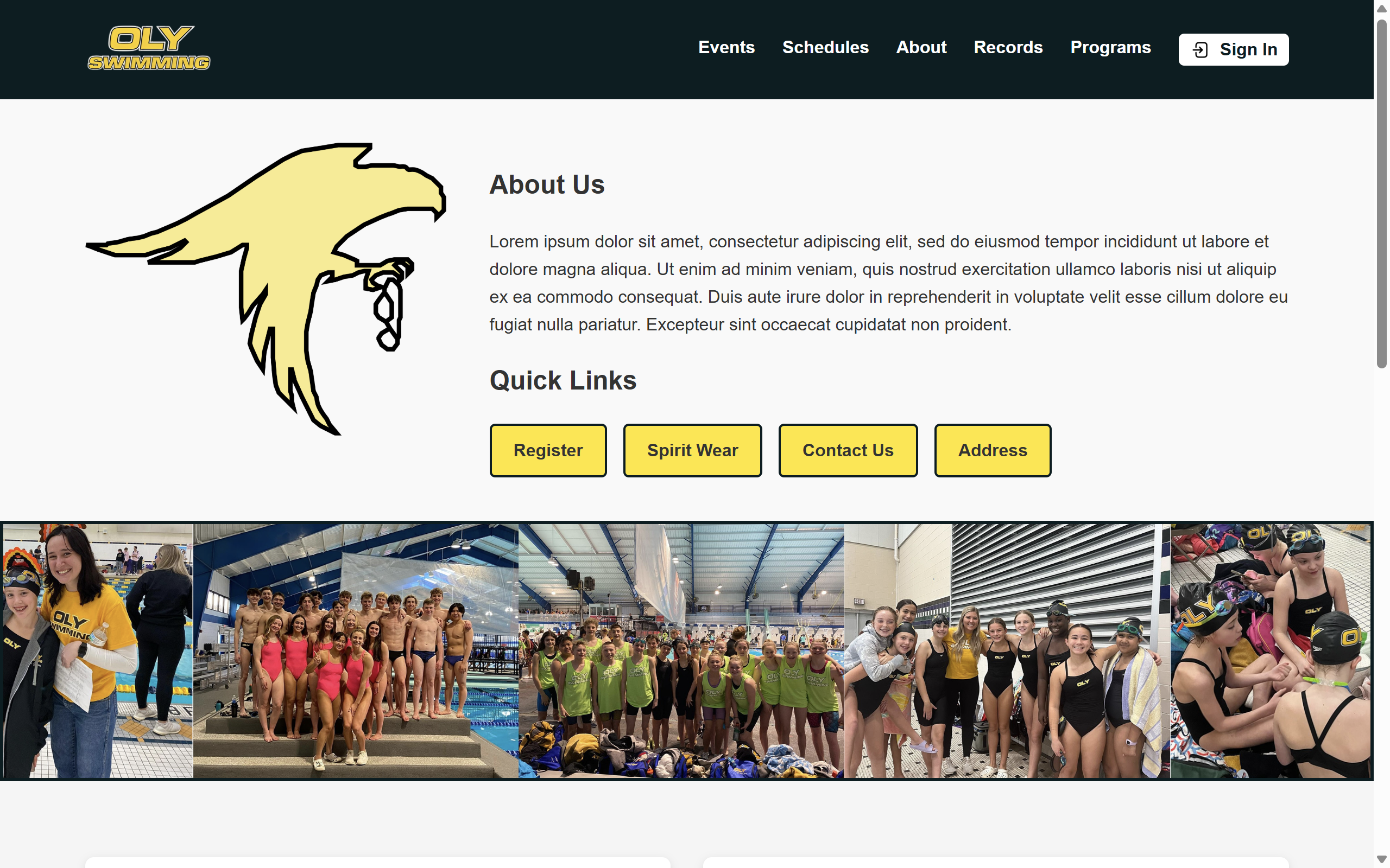
Implementation
The redesigned website was built using HTML and CSS with a focus on responsiveness and accessibility. I used flexbox and CSS Grid for layout management.
Key Implementation Decisions
| Category | Original Issue | Solution |
|---|---|---|
| Navigation | Complex navigation with dropdown menus that extend below viewport, links that lead to nothing, and multiple links that lead to the same page. | Simplified navigation structure with no redundant or useless links, and a hamburger menu for smaller screens |
| Visual Hierarchy | Important buttons like "Register Here" were hard to find | Prominently placed call-to-action buttons with high contrast colors |
| Accessibility | Poor contrast, missing alt text | WCAG-compliant color contrast, proper alt text for all images |
| Images | Slow loading, difficult navigation | Naturally scrolling gallery which moves for different screen sizes |
Conclusion and Reflection
This project taught me about the importance of responsive design and accessibility in creating effective web interfaces. By analyzing the original website's issues and addressing them, I was able to create a more user-friendly experience that meets modern web standards.
Key takeaways from this project:
- The importance of a consistent visual language and style guide
- How to prioritize content and features based on user needs
- How responsive design principles can accommodate diverse user needs
The redesigned website significantly improves the user experience by addressing the efficiency, learnability, and memorability issues identified in the original site while enhancing accessibility for all users.