Introduction
How can we create an interface on Partiful for users to host and attend multi-part events?
In this case study, I worked with a team of three other students to iteratively design a feature for Partiful, a party-hosting startup designed to make planning and RSVPing to events feel intuitive, effortless, and fun. I balanced collaboration and industry feedback while iterating through sketches, prototypes, and designs.
While Partiful shines in creating single-day events, it currently doesn't support multipart events—experiences that span multiple days or include sub-events. Think a pregame then a concert, or a birthday trip with a beach day, dinner, and a sleepover. This is what we set out to design for.

Problem: There's no streamlined way to create multi-part events with Partiful.
Currently, multi-part events on Partiful are either represented by multiple separate events, or one large one. There's no integrated feature for them.
No competitor—Google Calendar, eVite, iMessage, etc.—has effectively solved this problem, so we pulled from our personal experiences as college students to inform our designs.

Goal: Design an intuitive and smooth interface which supports multipart events for both hosts and guests.
Our Approach
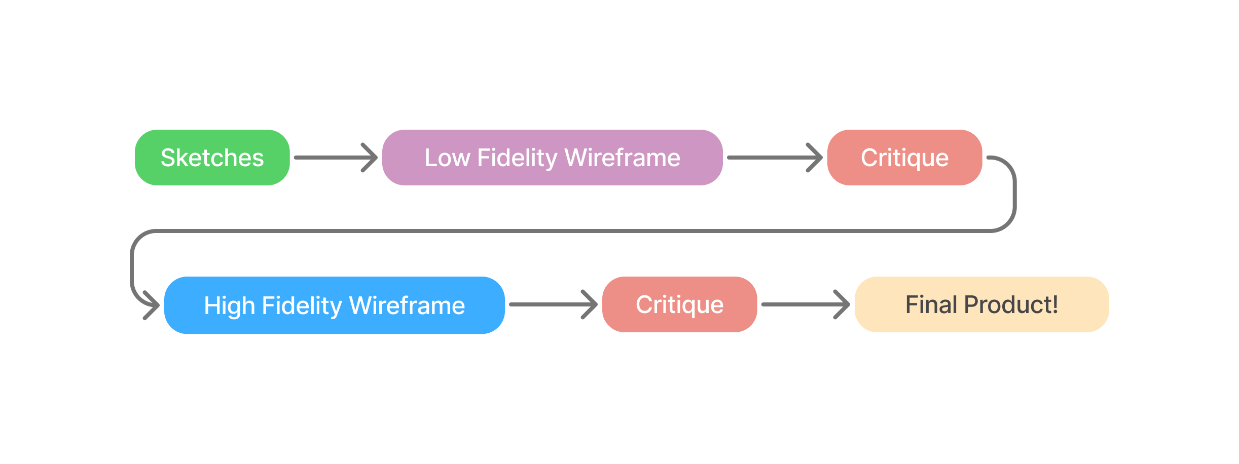
Our iterative design process included four key phases:
- Sketch: Use hand-drawn sketches creatively to explore possible solutions
- Lo-fi Wireframing: Creating a skeletal framework for our design
- Critique & Feedback: Getting feedback and recommendations from industry designers
- Hi-fi Prototyping: Developing a polished, interactive prototype in Figma
- Critique & Feedback: Getting feedback again on our previous prototype
- Final Product: Polishing our design based on the final feedback
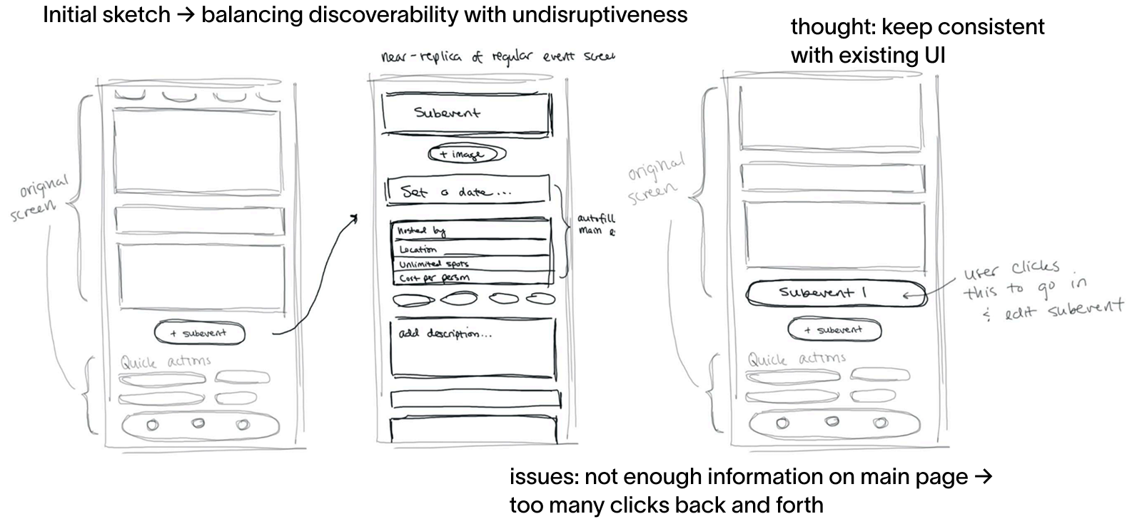
Sketches
To explore different directions, our team brainstormed and sketched various design concepts. We focused on different ways to structure multiple subevents, help users RSVP clearly, and maintain Partiful's simple UI. We've included a few of our favorites!
Design considerations
- Subevent display: Should subevents be organized vertically or horizontally? Is there a hierarchy with one main event?
- Partial attendance: How do we account for users who might not be invited to every subevent?
- Creation flow: When would users decide to create a multipart event versus a single event? How would we accommodate users who may change their minds through the process?
- RSVP Experience: How can users RSVP to multiple events without being overwhelmed with information? How would events appear to guests not invited to every subevent?
Initial Brainstorm
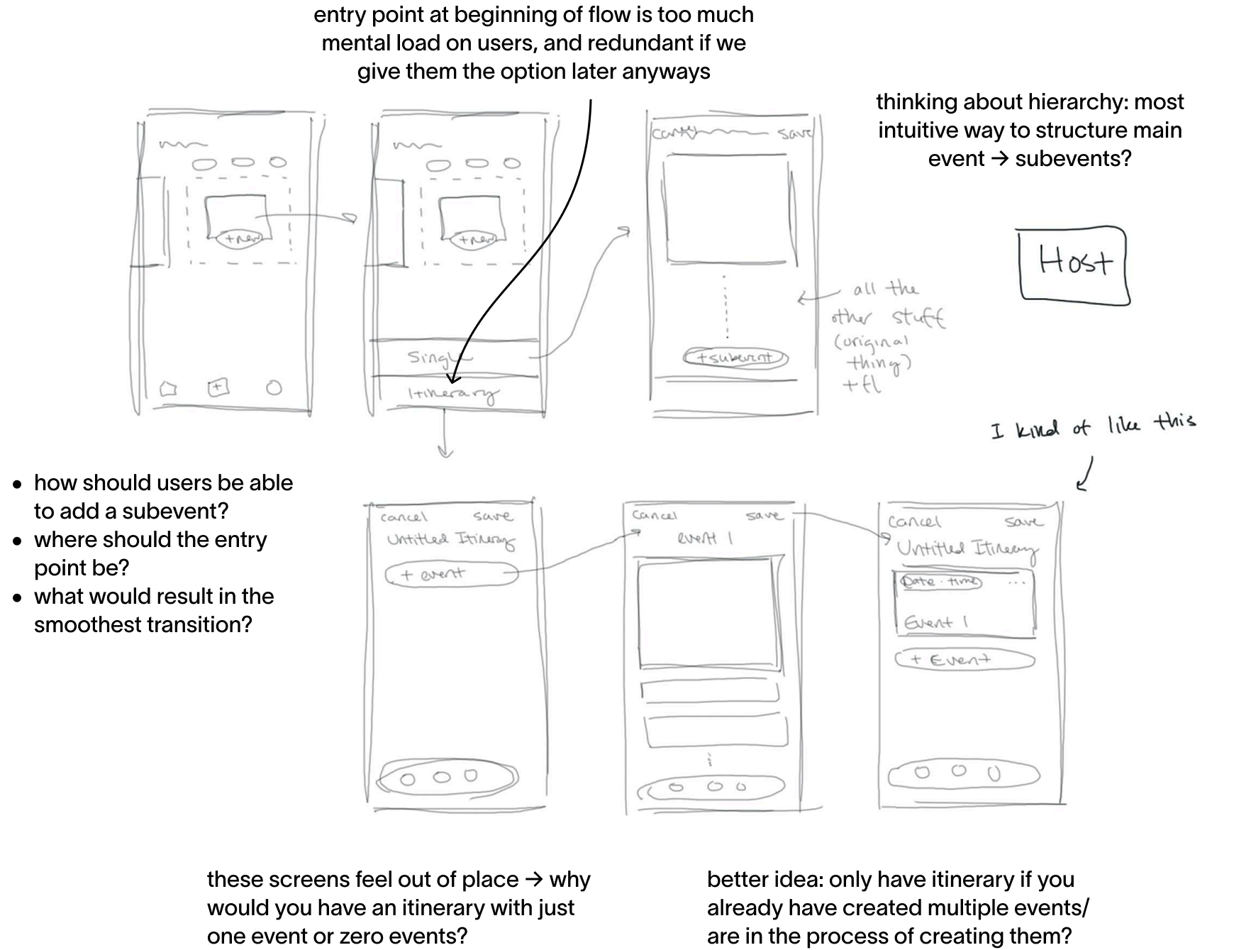
Potential Entry Points
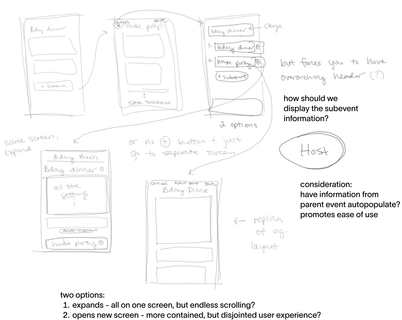
Subevent Display Options
Combining our ideas into a cohesive prototype
After evaluating our initial sketches, combining the strongest elements from each design concept and created lo-fi wireframes for them using Balsamiq. These wireframes represent the skeletal framework of our solution, focusing on structure and user flow rather than visual design.
Guest Experience
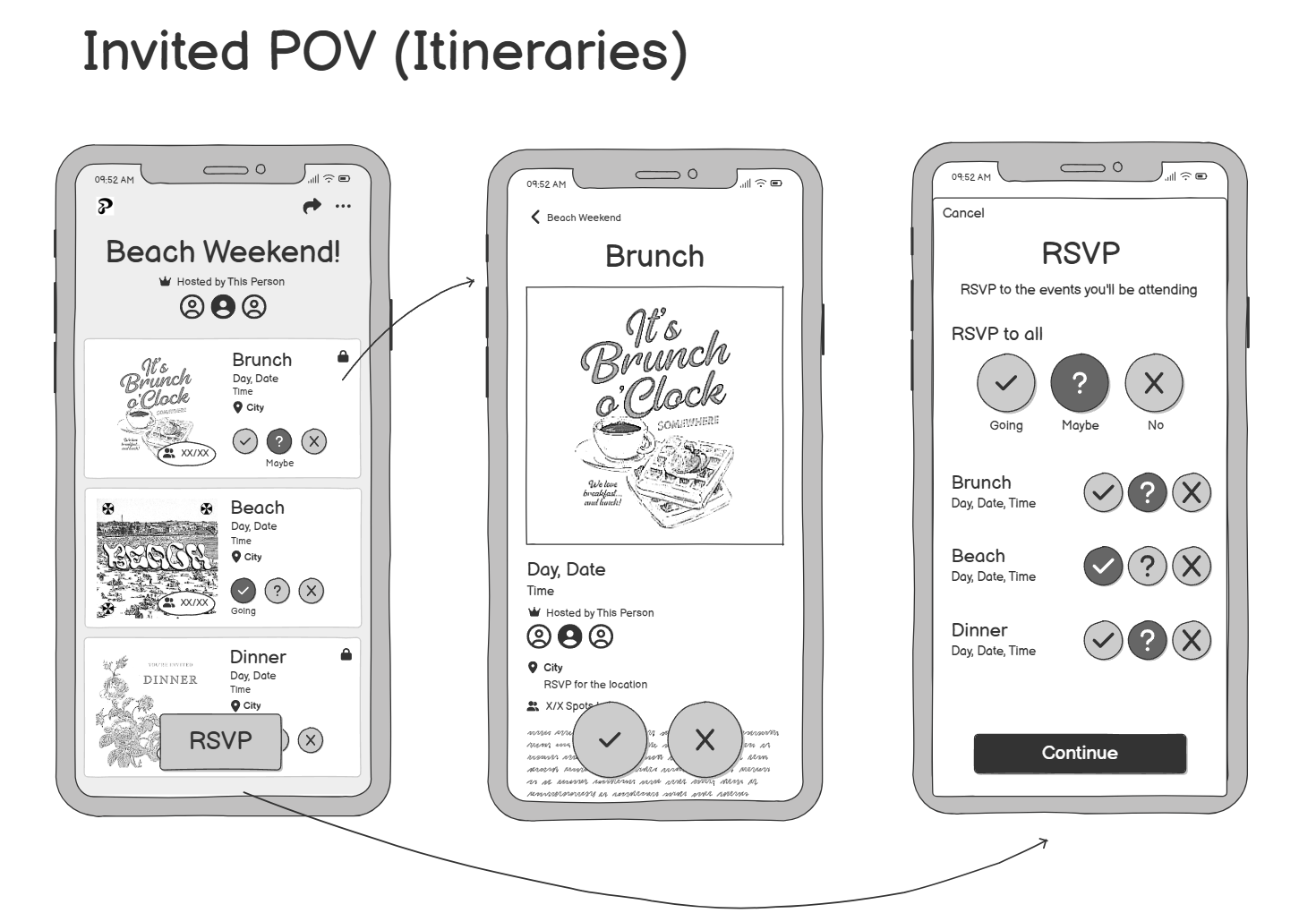
- Screen 1: This is where they would see the itinerary, a preview of all subevents. We chose a vertical scroll layout for mobile readability with events displaying chronologically. This helps guests quickly grasp the scope of a multipart event, and the details displayed help them efficiently understand the purpose of each subevent.
- Screen 2: This page appears when a guest taps a subevent, including further information, a full-size image, RSVP action buttons, etc. This design aims to let users focus on one subevent at a time and learn more before deciding.
- Screen 3: This screen consolidates RSVP actions across all subevents, with an "RSVP to all" feature for efficiency. We wanted to reduce decision fatigue and anticipate edge cases like partial attendance, and make RSVPing centralized to one page.
Host Experience
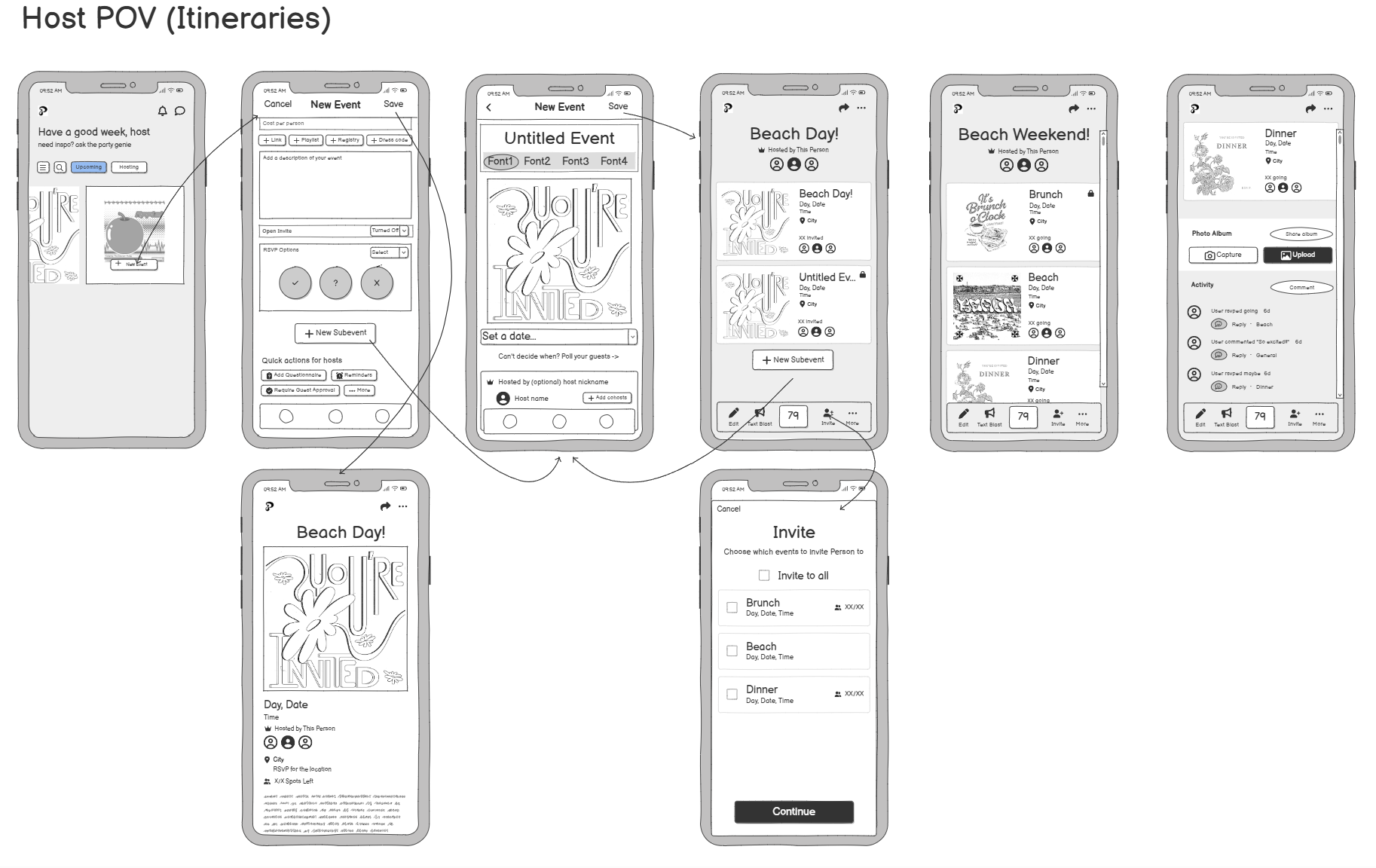
- Screen 1: Host dashboard entry point.
- Screen 2: On this page, hosts add the overall event title, image, and event information. From here, they can either save the event (i.e. there are no subevents) which takes them to a completed event page (Screen 3), or they can click "+ New Subevent".
- Screen 4: Each subevent has its own title, time/date, image, location, and settings. We wanted the interface to be familiar and consistent, so it uses the single event creation UI.
- Screen 5: Once a subevent is saved, the host will see an itinerary-style page, similar to the guest POV.
- Screen 6: The host can invite a specific person or create a specific link that provides access to particular events (i.e. not everyone is invited to every subevent).
- Screen 7: Once they finish editing their event, the host can see the whole thing along with their command panel at the bottom.
- Screen 8: Scrolling down reveals the activity and photo album areas, which are below each event.
Wireframe Critique
Industry feedback that shaped our final design
After creating our lo-fi wireframes, we presented them to Caroline Walters, a program manager at Google Ventures, and Ally, a designer at Partiful. They provided valuable feedback that helped us refine our design.
Google Ventures Feedback
We met with Caroline Walters, a program manager from Google Ventures, who provided the following valuable perspectives:
- Draw inspiration from widely-used platforms like Google Calendar—what makes them intuitive?
- Consider how to attract users who don't currently use Partiful
- Focus on enhancing core functionality rather than adding complex features
Partiful Feedback
Ally from Partiful provided critical insights that guided our hi-fi designs:
- Simplify the user experience—subevents should not feel like standalone events
- Treat the main event as a central anchor with subevents as lightweight extensions
- Include only essential info for subevents: title, time, emoji indicator, and optional location
- Consider how to handle photos and comments to prevent guests from feeling excluded
This feedback really seemed to indicate that we had gone in the wrong direction and overcomplicated the task at hand. While it's good to consider and design for edge cases, we needed to take a step back and simplify our design to align with Partiful's core values of simplicity and ease of use.
Hi-Fi Prototype
Bringing our solution to life with an interactive prototype!
Note: this project is under NDA, so our below Figma is password locked. Please continue on to read our notes!
Based on the feedback received, we simplified our design then created a more realistic and interactive prototype in Figma that simulates the actual user experience. Our hi-fi prototype incorporates the following key improvements:
- Consolidated event information to reduce navigation complexity
- Created a tagging system for photos and comments to associate them with specific subevents
- Simplified interfaces to maintain Partiful's clean aesthetic
- Redesigned RSVP flow to provide necessary context for decision-making
Final Refinements
After reviewing our hi-fi prototype with Ally, we made these final adjustments:
| Before | After |
|---|---|
| RSVP interface was overwhelming with too many buttons and options | Split functionality across two screens with clearer purpose and improved information hierarchy |
| Itinerary section placed too low on event screen | Moved itinerary up as primary content, making multipart capabilities immediately visible |
Conclusion and Further Steps
Key takeaways and opportunities for future development
All in all, this project challenged us to balance simplicity with user needs, extending Partiful's capabilities while staying true to their straightforward, unique designs. Through several rounds of iteration and feedback, we created a comprehensive solution for multipart events.
Key Takeaways
- User-centered design: Remember that you are a user too—your experiences can inform design decisions when combined with diverse user feedback!
- Design for edge cases: Thoughtful design accounts for unexpected use patterns—what happens if a user creates 10 subevents instead of three? What if event names are unusually long?
- Iterative process: Each round of feedback revealed blind spots and improved our solution in ways we couldn't have anticipated initially.
Future Directions
- Broader user research: We would benefit from formally polling users from diverse backgrounds beyond our own experiences. It might be useful to consider demographics like a party school versus a more academically-focused school, co-ed vs single gender, etc.
- Accessibility review: A more in-depth review would ensure the experience works well for users with different abilities, including across screen readers and joint mobilities.
- Integration testing: We would want to see how the multipart event feature integrates with existing Partiful features like photo sharing and chat.
Final thought: Our solution successfully bridges the gap in Partiful's features, allowing users to create cohesive multipart events while maintaining the platform's signature simplicity and delight.