


Introduction
Popup dialogs appear everywhere, whether to warn you about deleting a file, ask for your email, or offer a discount. But how do these popups incorporate accessibility for user interaction? How do they handle multiple forms of inputs, and what are their different states?
This case study examines three different approaches to cookie consent popups and analyzes what they do well and poorly from the perspective of users using different input methods.
The Goal: to improve the accessibility and design of a popup component
Examples
Below are examples of cookie consent popup dialogs from three popular websites—Filmin (streaming service), FIFA (sports organization), and H&M (fashion retailer)—in different states. Click to expand!
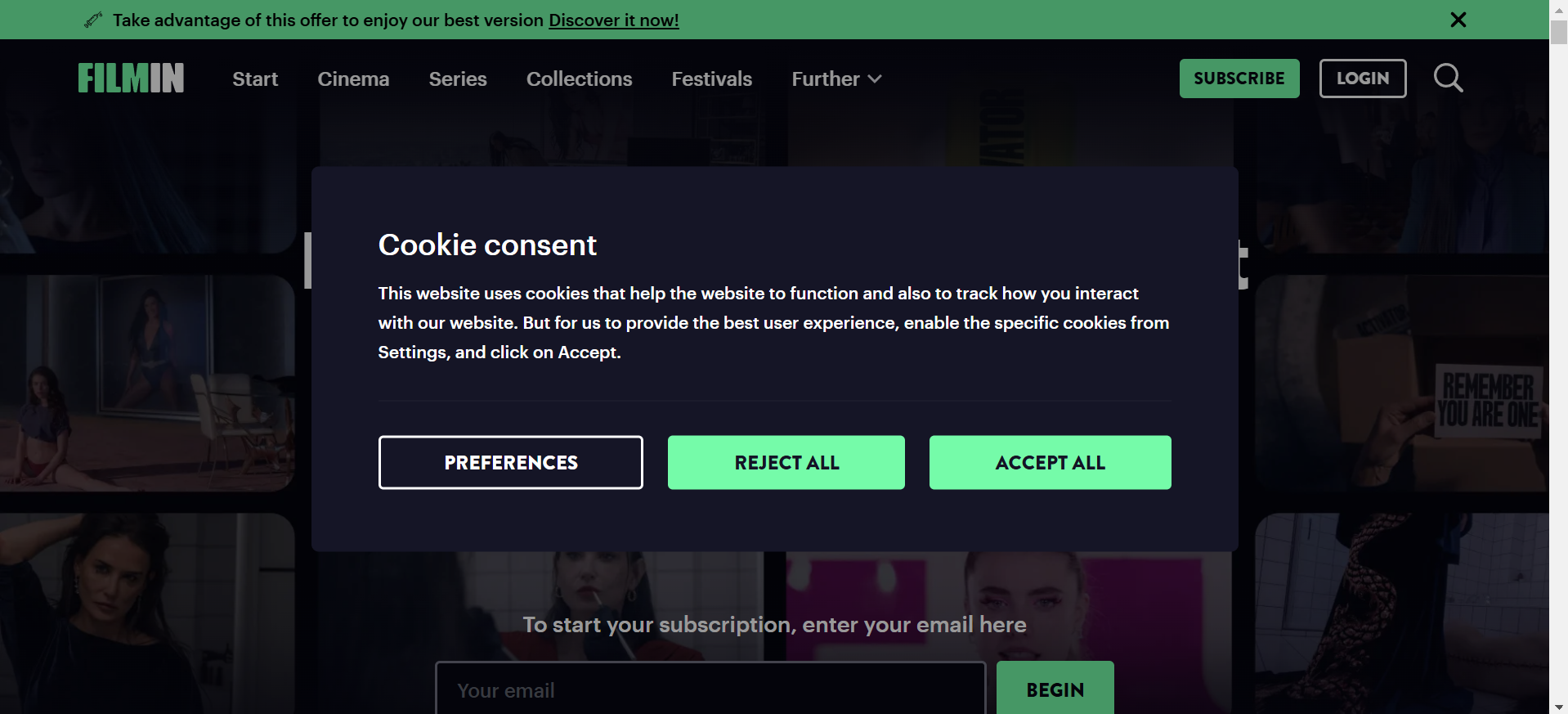
Filmin Full Screen
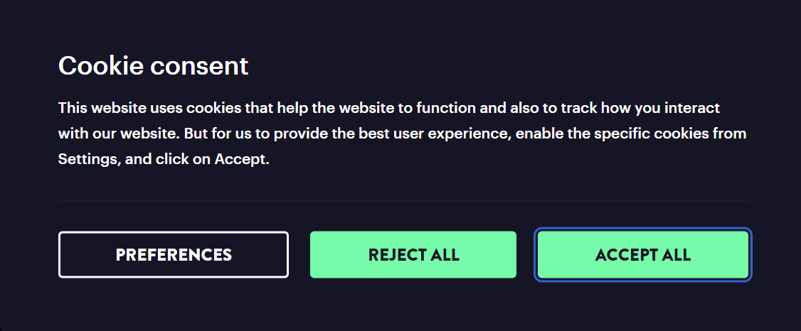
Filmin Focus State
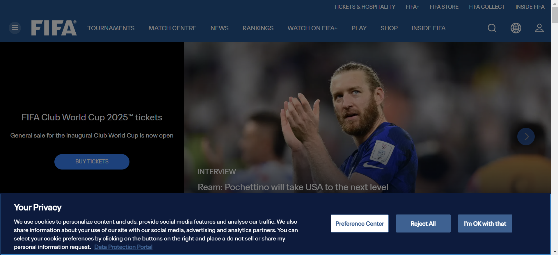
FIFA Full Screen

FIFA Focus State
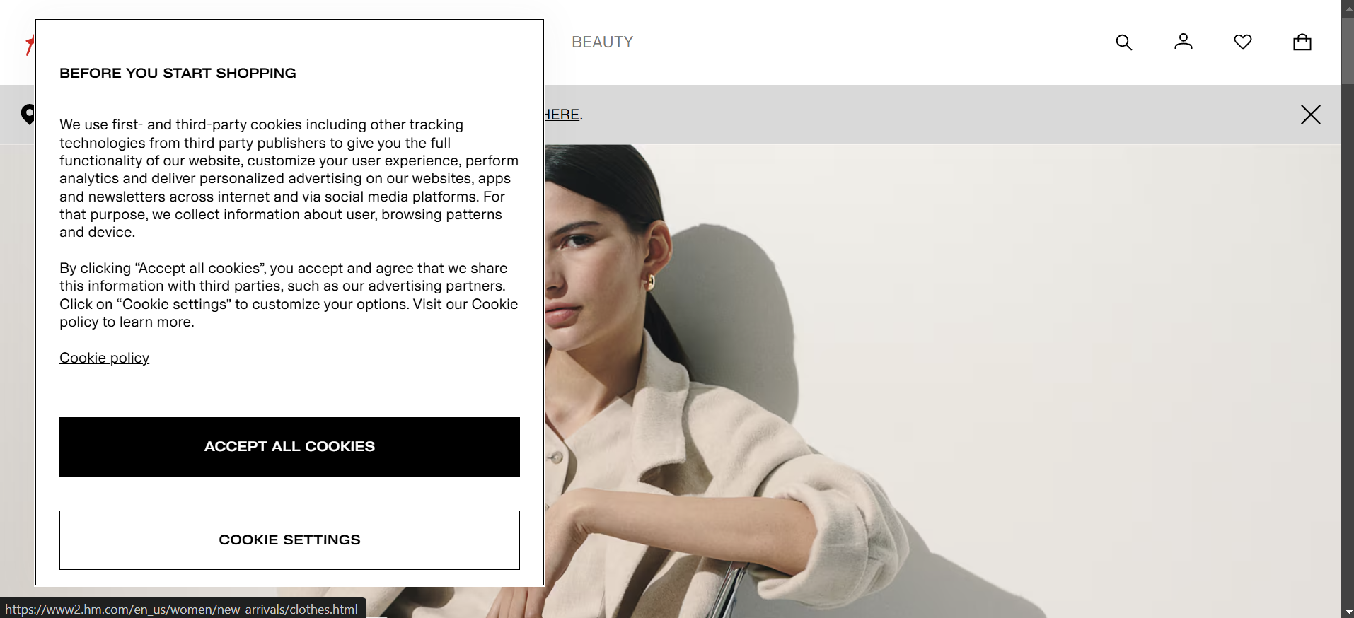
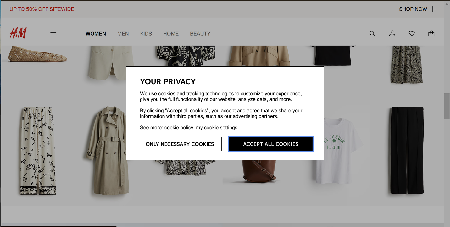
H&M Full Screen
H&M Hover State
Analysis
To evaluate popup usability, I analyzed how users interact with them via different input methods and how effectively each popup communicates its purpose and state. I focused on aspects like focus control, learnability, and efficiency.
Input
| Input Method | Filmin | FIFA | H&M |
|---|---|---|---|
| Interacting Outside Popup |
|
|
|
| Mouse |
|
|
|
| Keyboard |
|
|
|
| Learnability, Memorability, Efficiency |
|
|
|
Output
| Output Type | Filmin | FIFA | H&M |
|---|---|---|---|
| Default Appearance |
|
|
|
| Focus State and Order |
|
|
|
| Pressed/Clicked State |
|
|
|
| Screen Reader Behavior |
|
|
|
State Models & Component Redesign
From my experience interacting with the popups, I've idetintified H&M's popup as one with the most interesting design and with many possible issues. Continuing my study, I created two state models which visualize how a user may interact with H&M's popup. One model focuses on mouse users, and the other keyboard users.
I then revised and optimized those state models, making a trade off between mouse and keyboard users while doing so. The redesigned state models are below.
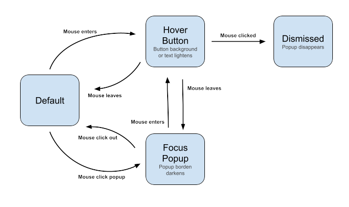
The mouse user state model is relatively complicated due to the absense of a focus lock. Users can focus the popup by clicking it, and hover buttons to activate hover effects. Then, clicking a button dismisses the popup.
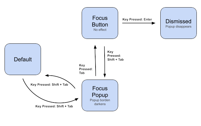
The mouse user state model reveals a confusing interaction sequence due to the lack of focus indicators and a focus lock. Users can focus the popup by pressing Shift+Tab, then tab to select the button they'd like to focus. Pressing enter on the correct button will dismiss the popup.
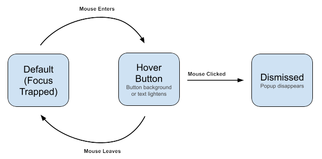
The revised mouse flow introduces more consistent interaction patterns. Now that the focus is locked, mouse users are unable to unfocus the popup and the interaction is simplified.
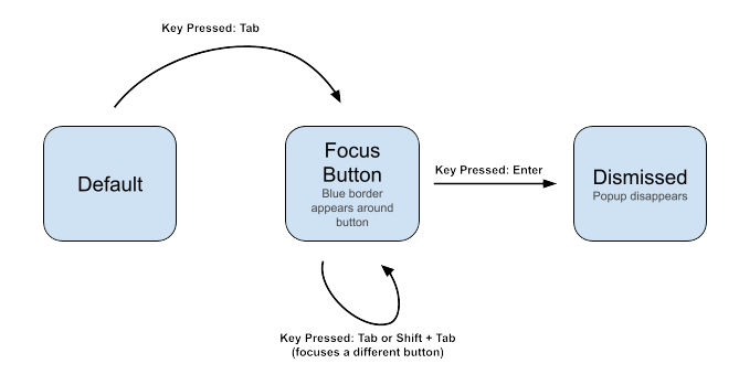
The revised keyboard flow addresses key accessibility concerns. Now, focus is locked and navigation is much easier for keyboard users, preventing them from getting lost within the page. There are also focus indicators to inform users of their location.
Trade-off: Adding automatic focus and focus trapping improves accessibility but could be disorienting for users who expect to navigate the page first. Now, keyboard users can more easily navigate the component, but mouse users are unable to explore other links or ignore the prescence of the component. The component was made more accessibile and useable for keyboard users, but visiting the webpage is now less efficient for mouse users (as they must address the component).
H&M Component Redesign
After analyzing the H&M's cookie consent popup and creating new state models, I redesigned it in an attempt to improve accessibility and usability.
Original H&M Component
Current Implementation
- Title unclear
- Paragraph long (inefficient)
- Poor focus indicators
- No focus lock
- No visual indicator of importance
Redesigned H&M Component (Focus State)
Improvements
- Create a title clear to function
- Greyed out the background
- Implemented focus trap for keyboard navigation
- Added visible focus indicators
- Improved semantic structure with proper ARIA roles
- Simplified button options
The redesign maintains H&M's minimalist visual identity while significantly improving accessibility for all users. Now that the component is simpler in nature, it is more efficient (less text and buttons), memorable (center of screen), and learnable (clear titles and labels)
Reflection
The components observed showed varying degrees of success in accessibility. Filmin and FIFA did well with proper focus management and clear visual indicators, which I incorporated into my redesign by implementing focus trapping and visible focus states. H&M's original design lacked these features, creating significant barriers for keyboard users.
My redesign addresses several accessibility considerations that were overlooked in the original H&M implementation, particularly the lack of keyboard focus indicators and focus trapping. I also simplified the content to enhance efficiency and learnability.
The redesign solves for a "mismatch" as defined by Kat Holmes by eliminating the interaction barrier between the user and the interface. When a popup lacks proper keyboard navigation, it creates an artificial barrier that excludes users who rely on keyboards for navigation, effectively designing for exclusion rather than inclusion.
Input and Output Impact on Accessibility
- Positive impact: Filmin's focus trapping ensures keyboard users with motor impairments can navigate the popup without accidentally tabbing away, providing a controlled and predictable interaction pattern.
- Negative impact: H&M's lack of visible focus indicators creates a significant barrier for users with visual impairments who rely on keyboard navigation, as they have no visual cue about their current location within the interface.
Among the different user types, mouse users are most commonly prioritized in component design, as evidenced by all three examples having clear hover states but inconsistent keyboard support. This prioritization creates an imbalanced user experience that disadvantages keyboard users, screen reader users, and those who rely on assistive technologies, effectively excluding a significant portion of potential users from easily interacting with these essential interface components.
Key Takeaway: Inclusive design isn't about creating specialized solutions for different user groups, but rather about designing interfaces that adapt to diverse human needs and abilities. The redesigned popup is more accessible not because it adds special features, but because it removes unnecessary barriers to interaction.